Reports
The Pivot tables feature provides a structured way to present various metric values in a detailed and organized format. By using a table-based approach, reports allow for advanced customization, including filtering, grouping, and column customization, to ensure the most insightful data presentation.
With reports, you can visualize metric values flexibly, analyze data from
different perspectives, and tailor dashboards to meet specific
needs.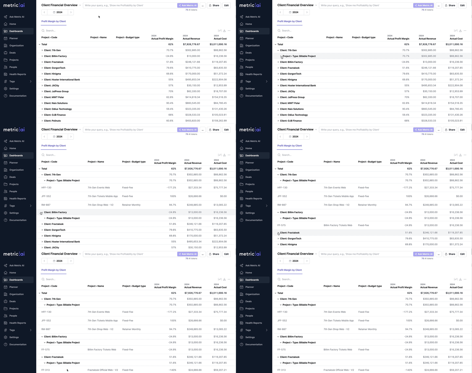
How to Add/Edit a Pivot table
To create or modify a report, follow these steps:
- Open Dashboard from the left-side menu.
- Navigate to the dashboard where you want to add or modify a report.
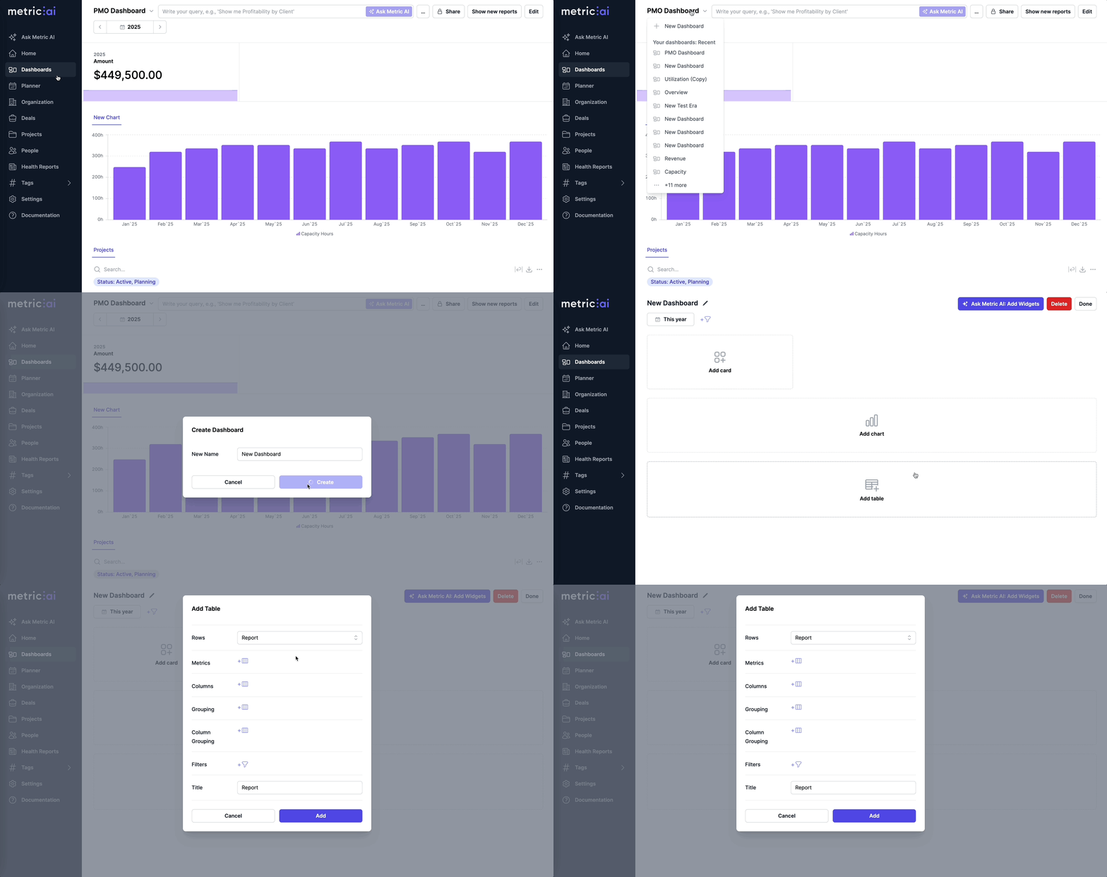
- Click Edit in the top-right corner to enable dashboard editing mode.
Note: You must be an Editor or Owner of the dashboard to modify it. See the Dashboard Sharing article for more details.
- Click + Add Table to create a new table, or click the Gear icon next
to an existing report to edit it. New tables use Pivot table as their
default Type.
Configuring the Pivot table
- Set Type to Pivot table.
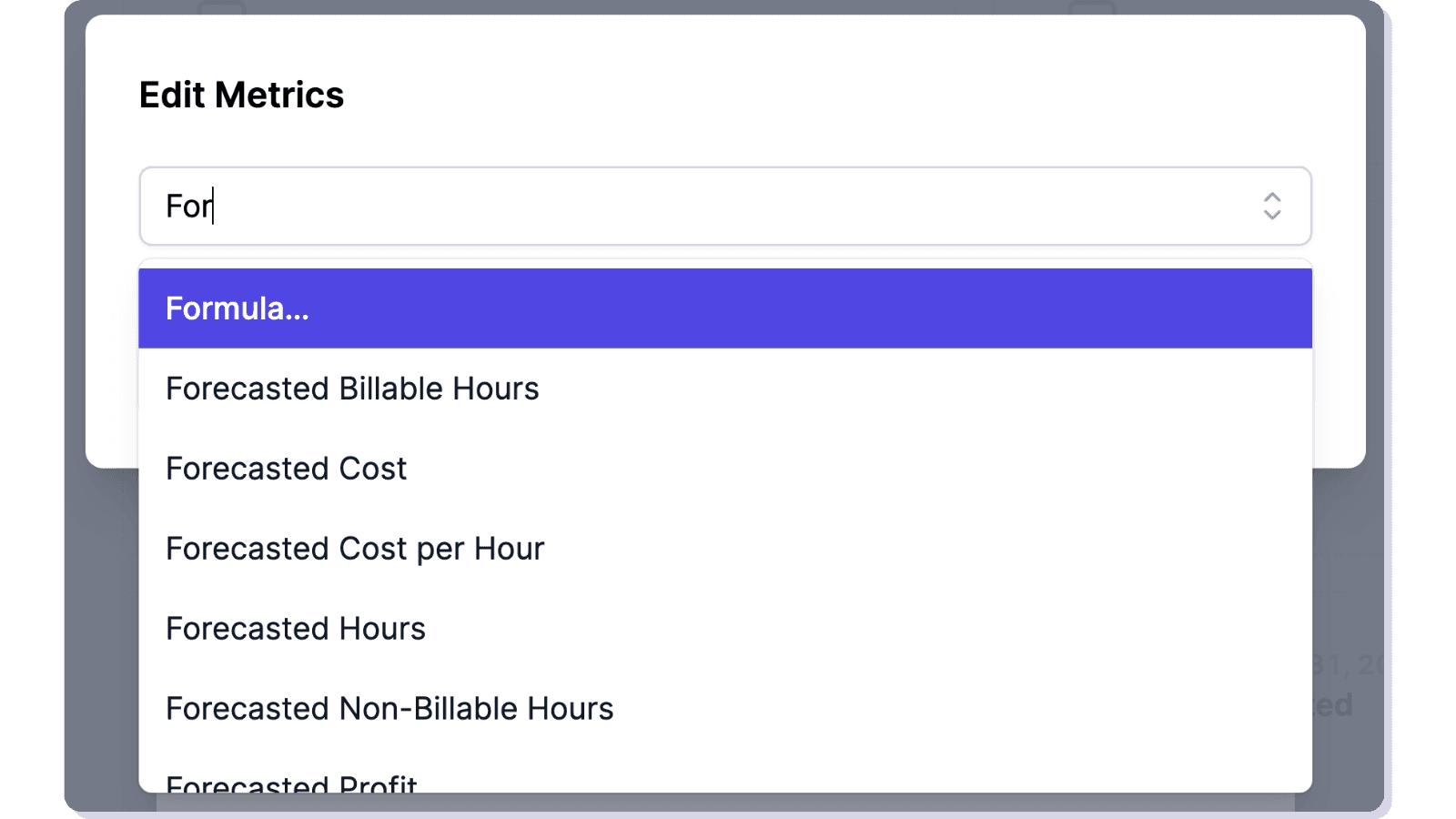
- Select Metrics to display in the report:
- Tip: Start typing the metric name to quickly find it in the list.
- You can also add a custom Formula (see the Formulas article for more details).
- Edit selected Metrics as needed:
- Click on a metric name to enter edit mode.
- Reorder metrics using drag-and-drop to change the column order.
- Show/Hide a metric by clicking the eye icon.
- Delete a metric by clicking the cross icon.
- Duplicate a metric by clicking the duplicate icon.
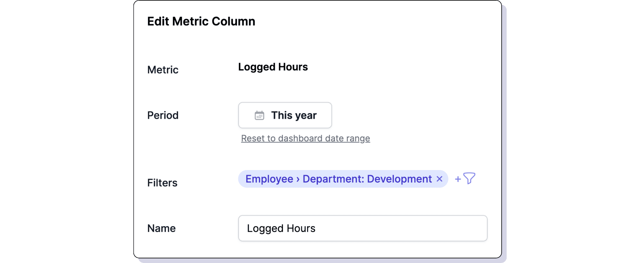
- Edit a metric by clicking the pencil icon, where you can:
- Change the name of the metric column.
- Adjust the date range (by default, it follows the dashboard date range, but you can override it).
- If overridden, you can Reset to dashboard date range.
- Apply filters to the metric.
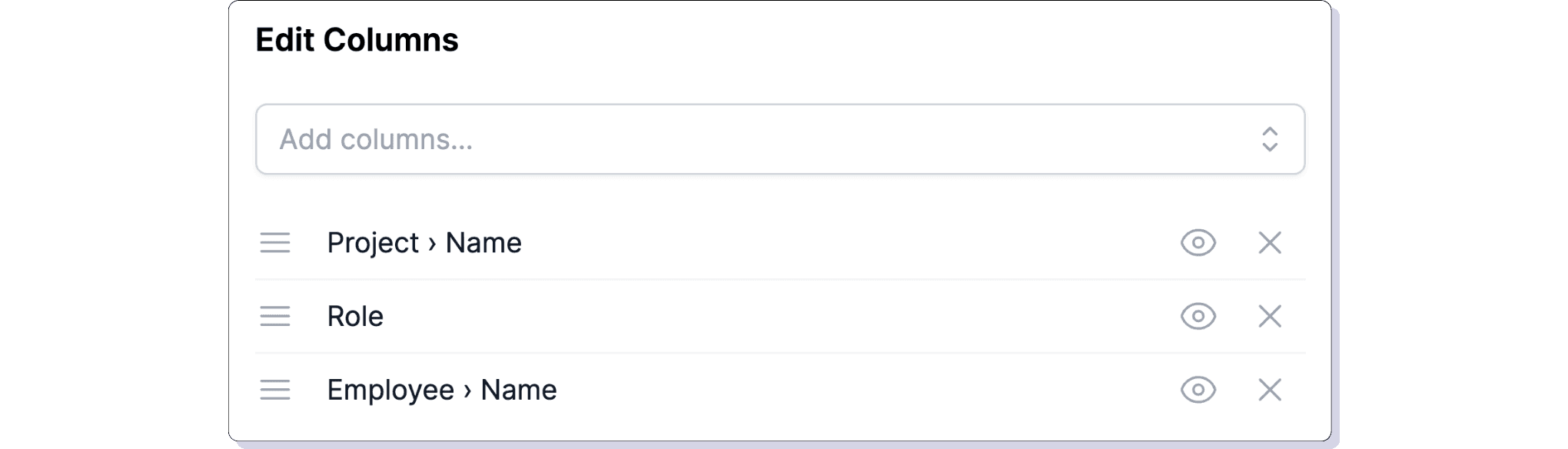
- Select Rows to structure data:
- For example, selecting Employee › Name will break down metrics by employees (see example).
- Set Row grouping (Optional):
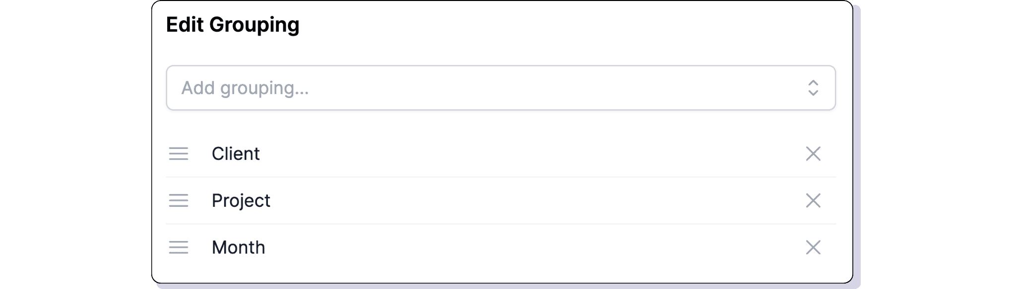
- Allows hierarchical structuring of data.
- Example: Selecting Client and Project will group data first by Client, then by Project, displaying subtotals at each level (see example).
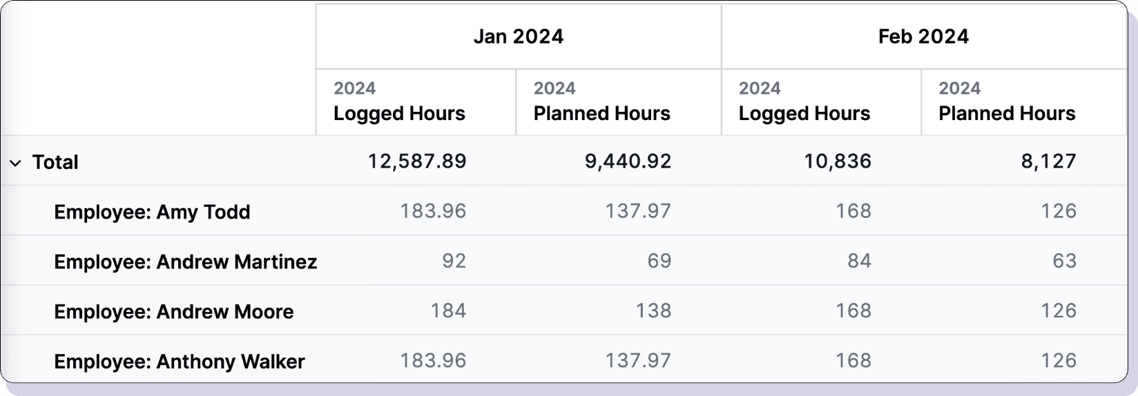
- Set Columns (Optional):
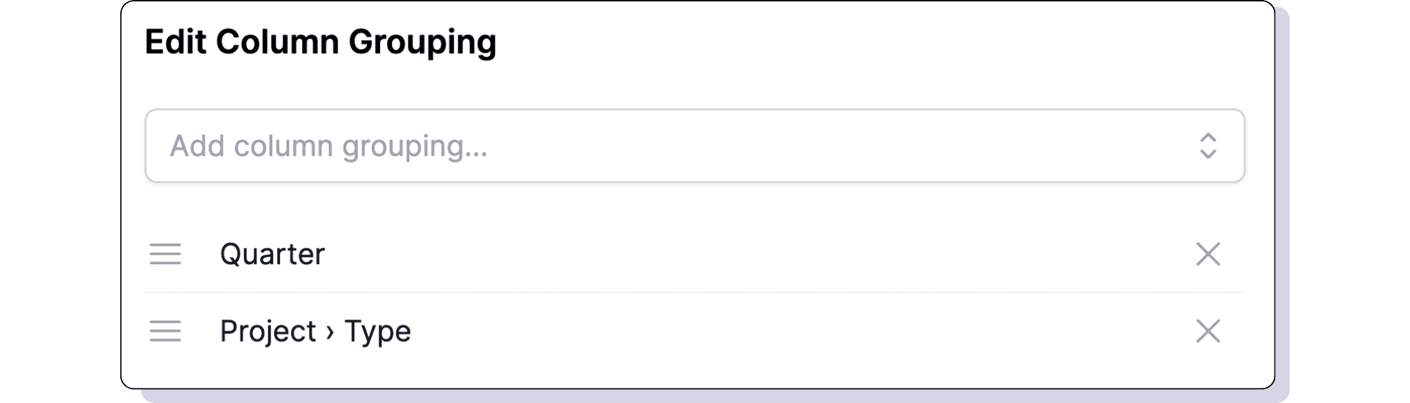
- Allows for hierarchically grouping metric columns (see example).
- Apply Filters (Optional):
- Filters affect the entire report (all metrics).
- The metrics can be filtered by various criteria (such as Client, Department, Project, etc.) to help narrow down and focus on the most relevant data.
- If the dashboard already has filters, they will apply by default but can be toggled off.

- Enter a Title for the report and Save it.
Rows vs. Row Grouping vs. Columns
Different ways of structuring and displaying data:
Example 1: Using Rows
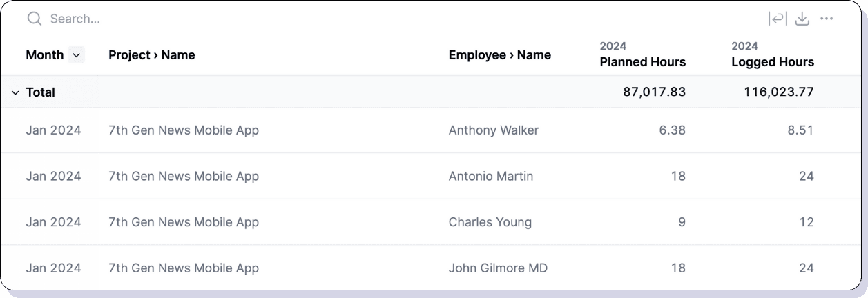
If we select the following Rows: Month, Project › Name, and Employee › Name. The report will display:
| Month | Project › Name | Employee › Name | Logged Hours | Planned Hours |
|---|---|---|---|---|
| Jan 2025 | A | Alan Smith | 80h | 100h |
| Jan 2025 | A | Amanda Wilson | 60h | 55h |
| … | … | … | … | … |
| Dec 2025 | Z | Zack Doe | 0h | 25h |
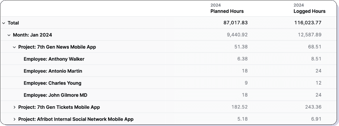
Example 2: Using Row Grouping
If we set Row grouping to Month, Project, and Employee, the report will be structured hierarchically, displaying subtotals at each level:
| Logged Hours | Planned Hours | |
|---|---|---|
| 1. Month: Jan 2025 | 1200h | 1600h |
| 1.1. Project: A | 140h | 155h |
| 1.1.1. Employee: Alan Smith | 80h | 100h |
| … | … | … |
Example 3: Using Columns
If we set Columns to Month, the table will dynamically display metrics for each month side by side.
Actions You Can Perform on Tables
You can manage tables directly from the dashboard using the following actions:
- Edit a Table: Click the pencil icon next to the table title.
- Reorder Tables: Drag and drop to change the order of tables on the dashboard.
- Delete a Table: Click the trash icon next to the table title.
- Duplicate a Table: Click the duplicate icon next to the table title to create a copy.
With these tools, you can customize tables to fit your specific business needs and ensure clear, insightful data presentation.