Oct. 1, 2025 - Improved Dashboard Charts
🚀 What’s new?
📊 Improved Chart Experience on Dashboards
We’ve enhanced the chart experience across Metric AI dashboards — making data visualization more flexible, clear, and insightful.
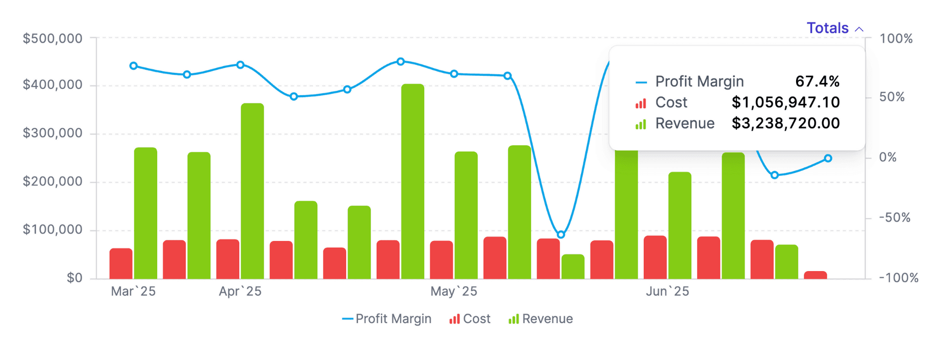
Now you can see Totals directly on charts, alongside period values. This helps you quickly understand both the breakdown and the overall performance for your selected metric.
➕ New Chart Settings
We’ve added several new configuration options to help you customize how your charts display and scale data.
🧮 Display Mode
You can now choose how data series are displayed on charts:
- Per Period — shows values for each individual period (default).
- Running Total (Chart Period) — accumulates totals across the selected time range.
- Running Total (All Time) — accumulates totals from the start of tracking.
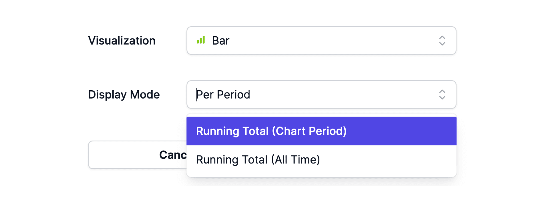
To adjust, open the chart editor → Edit Data Series → select Display Mode.
📈 Vertical Axis Min/Max
You can now control the min and max values for chart axes — improving readability for charts with Hours, Percentage, Amount, or Number scales.
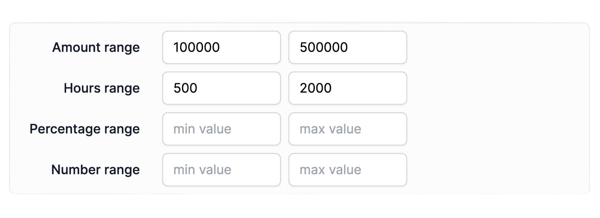
To configure, open the chart editor → Advanced Settings → set Min/Max Values.